Accessibility is getting a lot of attention in recent days, due in part to rising awareness of learners’ needs and also the increasing use of technology for learning. Now with concentration on making learning mobile, we need to consider the part accessibility plays within mobile technologies.
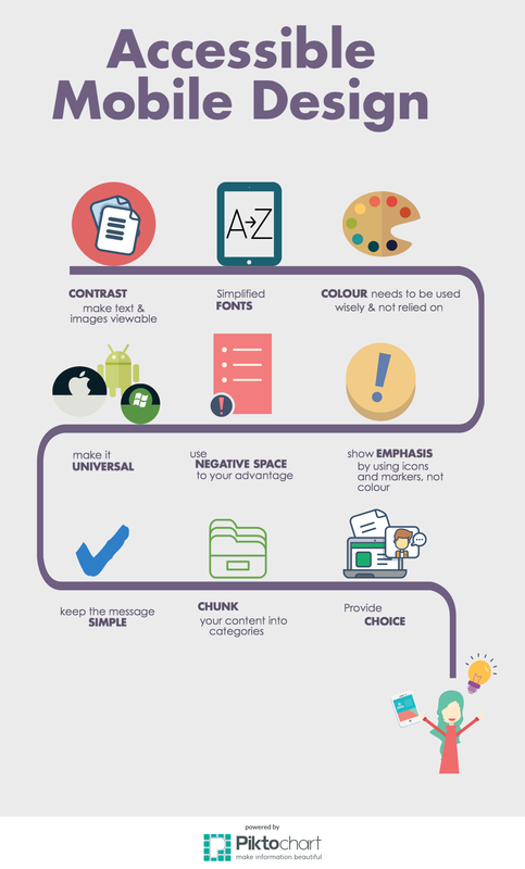
Below are some accessibility considerations when designing a lesson for a mobile platform:
Below are some accessibility considerations when designing a lesson for a mobile platform:

ContrastNecessary for text on backgrounds to make it easy for the reader to view the text. It doesn’t have to mean black and white to be effective, but you will need to test your presentation contrast. Use a tool like Juicy Studio to test whether the contrast of your colours is accessible on mobile screens.

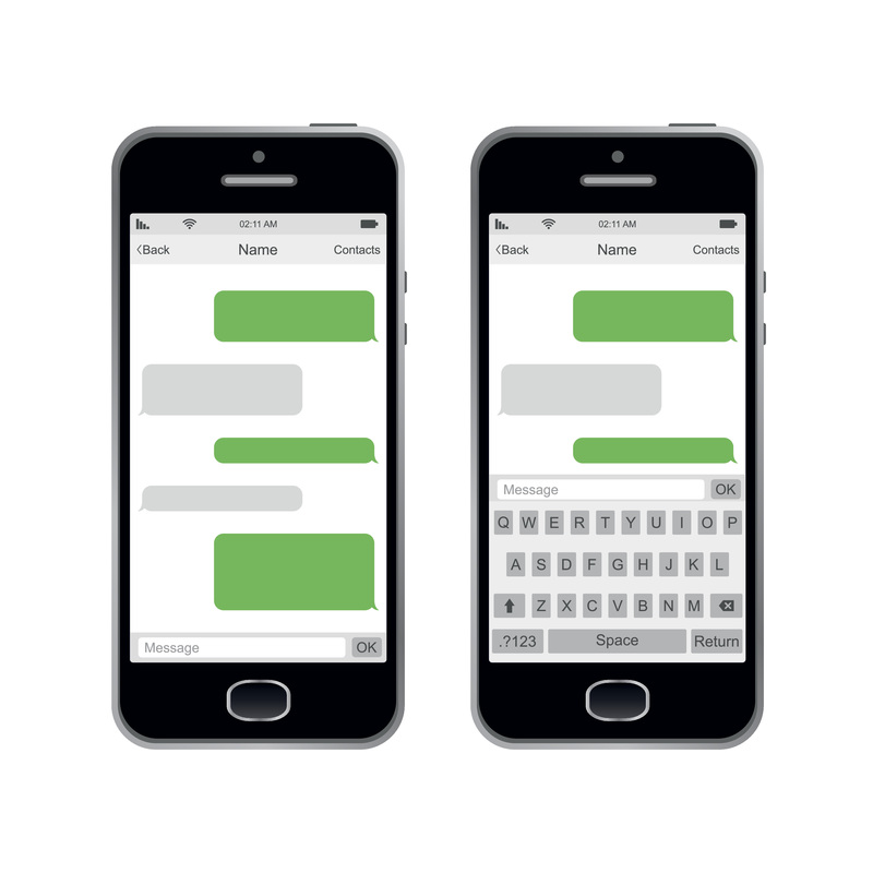
Negative SpaceAs with font, the use of negative space is as important as the use of space within a mobile device. No reader wants to be bogged down with text without any negative space. Break up large blocks of text with images, white space and vertical lines to separate ideas.

K.I.S.S.Deliver content in the simplest way possible in regards to length, tone and visual style. This will make it simple for all viewers, as well as those who may need further accessibility

CommunicationUse, and encourage learners to use, multiple methods of communication including online contact forms, email, news and discussion posts on the webpage or LMS. This assists learners who may need to use specific software, like speech-to-text, the opportunity to use the method that works best for them.

Offer ChoiceProvide multiple modes of consuming information: images, text, videos, audio etc. This helps learners to consume the information as it is easiest, and makes sense, to them.
|

FontRecent trends in design point to using thin and tall fonts that look clean and unobtrusive, but these fonts for someone with a visual impairment are nearly impossible to see, especially on a small mobile device. The same is true of bolder, block-style fonts. For optimal accessibility, you want to select a clear, average weighted font. Helvetica is known to be one of the most accessible and versatile fonts partially because of it being sans serif as well as the negative space between characters, making it easier on the eyes.

FlexibilityIt’s hard to know what type of device your learners will be using. It is not just the difference in brands (Apple, Samsung, LG etc.) or operating software (iOS, Android, Windows, BlackBerry) that needs to be considered, but also the type and size of the device. All of these will have an impact on the content and how it is presented.

Chunk-It“Chunking” or packaging the content into smaller sections helps users read and understand it better with time for reflection. It also helps users keep their place on a long scrolling page
Keep It FamiliarUse simple and familiar technologies, like SMS (short messaging systems) for texting. This prevents students who may need accessibility considerations from having to learn a new platform. Remind is a tool that allows teachers to text their students and students/parents to respond without each party knowing the other’s phone number. Using SMS also allows users to reflect prior to responding, so provides the comprehension time, no matter how long that is for learners with accessibility needs.
|

ColourYou cannot rely on the use of colour to convey a message or emphasis, as some colours cannot be seen by those who are colour blind or who have a visual impairment. Using other visual indicators for emphasis (bold or italics) is key when designing for accessibility.
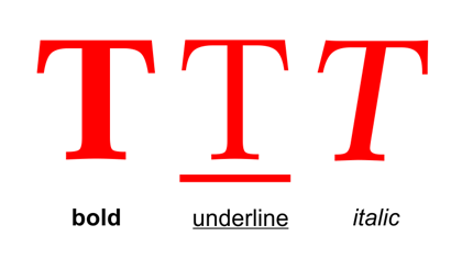
Emphasis MarkersTo follow the colour commentary above (pun intended), it is important to not overuse emphasis markers, such as bold, italics and underline. Underlining in the online world, and especially in the mobile tech world, is indicative of hyperlinks, so, your use of underlining may go unnoticed. Too much bolding or italicizing, for anyone, can numb your effect and make it more difficult to read.
CaptioningAny videos included within a course need to be captioned for those with hearing impairments. Ensure the captioning, if completed automatically by software, is accurate and makes sense to those reading it.

Alternate TextNot all images show up the way you intend them to on an m-learning platform, and many screen readers cannot actually “read” images. Instead, many online platforms will ask you to include alternate text for images you use. This allows you to describe, in simple words, what the image is so those who use screen readers can “see” the image through description.

NavigationMake navigation amongst the pages and links simple for users, especially those with low motor skills who may struggle to click on an intended link that is too closely placed to another

Identify GoalsTell the learner what you are hoping they will understand, or be able to do, after the content is consumed. This helps learners to focus on key points prior to reading/watching the content.
|
